
Regarding the Guild Office in Threads

I had quite a time designing the Guild Office in my story, Threads. It seemed like a simple enough task at first, since it’s just a single building that needed to fill a background. My backgrounds aren’t terribly complex anyway, so I figured I could get it done quickly enough and put it off until it was needed.
Well, I finally needed it, and regretted my decision to wait.
On one hand, I already had a basic idea for the guild office:

The entire guild area consists of a main office for guild officials, a school-type building for training inexperienced mages, and a large training ground that’s sectioned off for the trainee mages to practice in. The whole compound fills an entire city block that is surrounded by a large wall to avoid any unfortunate accidents with rogue magic. As for why they didn’t just wall off the training grounds, well, that would look weird so they just stuck the wall around the whole complex.
On the other hand, I knew basically nothing about city planning and had to at least figure out how big a city block is. I still know nothing about city planning, but some quick searching told me that…city blocks don’t really have a standard size a lot of the time, so I may as well make up my own dimensions and work with those. I threw a grid onto my canvas and started drawing lines to segment areas. A few things got rearranged and some sizes changed as I realized that, for example, parking can get pretty big pretty quickly. The end result was this:
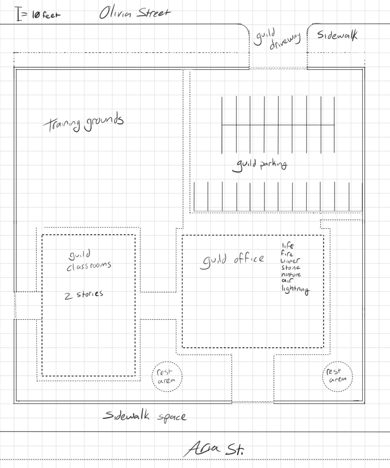
I tried to make this approximately to scale, with each grid space representing 10 square feet. The parking lot and classrooms switched places, and the entrances to the complex were shuffled. I also moved the wall around the parking lot in a bit more so that people waiting for the gates to open don’t have their back ends sticking out into traffic. The names of the streets don’t matter so I just chose some placeholders. The small dashed lines around the buildings and things represent walkways. The bolder dashed lines indicate the space I allotted for the buildings. In the guild office building, I wrote down the list of guilds that operate from that office. The Death Guild isn’t listed because they have an office of their own across the street. I’ll have to design that later, too…
Honestly, all I needed to design was the building. I didn’t really need to go through all of this planning…except that I did, because to know what the building looked like, I needed to know how big to make it. To draw the scene leading up to the building, I needed to know where the gates sit and how big the walkway is. To know that, I needed to know where everything is in relation to the other buildings in this area…there’s an awful lot of groundwork needed to make sense of things…
Once I had this approximate layout, it was time to start figuring out the building. Finally. After a quick search for “how tall is a story”, which frankly is something I should’ve figured out a long time ago. After all, this is an urban setting and there are lots of buildings in backgrounds…My lack of experience really shows in the first chapter. :T Oh well. Live and learn.
I made a little rectangle that was divided into eight parts on the same grid (though the scale changed to 1 grid square = 5ft squared). It’s in eight parts because each guild gets its own floor, plus one floor for reception and other things. I don’t have a picture of that rectangle because I deleted it without saving a screenshot, but I do still have the first attempt to make a building in all its scribbled glory:

I used Clip Studio’s symmetry ruler to make things easy; I only had to draw one side of the building and the other was mirrored automatically. As you can see, this design very rough and very busy. Still, I was able to work out about what I wanted from this building: arches, an enclosed walkway, emblems on each floor representing what guild operates from where. I wanted something a little fancy and cleaner than this, but got a bit stuck on how to fix this design. So, to get a better feel for the shape of this building, I decided to try working on a different angle: inside.
Starting with the first floor, I needed to figure out what it’s used for:
- Reception: letting people come in and ask questions, figure out which floor has the guild they need help from
- Let employees get to the other areas (the classrooms, parking lot, etc)
- And that’s about it.
So I came up with this:
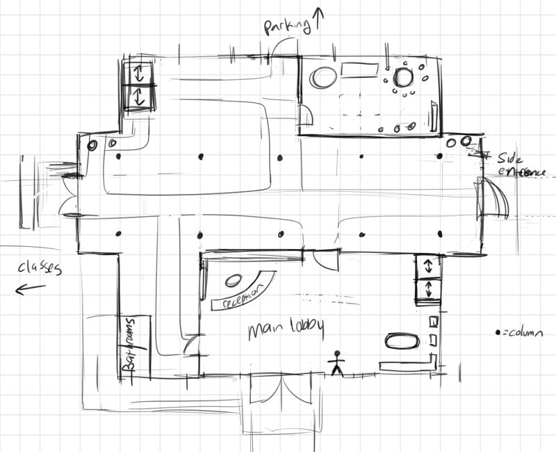
My diagrams suck, I know. The scale for this diagram is the same as the previous diagram, 1 to 5. Aside from having elevators and nice hallways and maybe a quiet spot for people to take breaks, I didn’t know what else could be there. By this point, my brain was screaming at me to stop over-planning when all I need is to know right now is how big the reception area is. So, to satisfy my desire to not let the building collapse on itself because there’s nothing in the middle, I just stuck some columns (the black dots) around the main walking areas.
Since I was already there, I decided to figure out the Life Guild’s floor plan, since that’s where Miles was heading:

I initially roughed about about where some spaces would be, but the only thing that was really important here was the guild leader’s office.
Going back to the sketch of the building’s front, I liked the idea of the fancy emblems on the front and thought maybe there could be a balcony for the guild leader offices. Once I decided on that, I shoved the leader’s office in front of the space that then became the balcony, and now everyone can see the guild leaders working if the curtains are open.
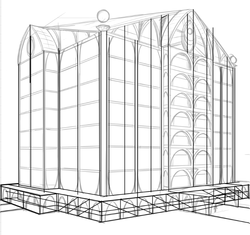
Once all was said and done, I realized that the shape of this building was different from the original sketch, and also that the original sketch couldn’t show that very well, so it was time to revise the idea. I chose to draw it from an angled view this time, and relied very heavily on perspective rulers to get things approximately in the right places:
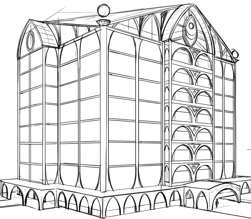
I simplified the original design greatly. Big windows, because I love big windows, with only the top and bottom guild floors framed to create a curved shape. The balconies were given arch designs as well because I wanted an interesting space in which to put the emblems. The covered walkway around the building has more arches because I like them, and the part covering the main entrance was curved because it seemed like a good idea. Another thing that was added simply because I like the idea: the columns on the corners with the floating orbs.
You may also notice that there’s another floor added on top of the building. That was added because I didn’t want the primary guild emblem to be part of the top guild office. The guild on the highest level is the Life Guild, and to put the guild’s emblem there makes it feel like the Life Guild is in charge of everyone when they aren’t. The ninth floor started with just me sticking the emblem above the top floor and then figuring out how the roof worked out after; I’m not very good with roofs. It ended up turning into a floor that primarily serves as a meeting space for the guild leaders. The large guild emblem is a window for guild leaders to stare dramatically out of.
Once the angled view was finished, it was time to re-sketch the front view:
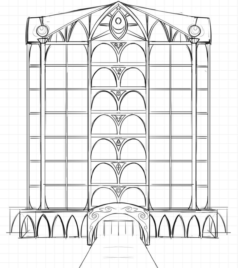
It’s nicer-looking than the initial scribble, and drawn more or less to scale.
Before doing any final linework, I took some time to try and fix the skewed window sizes, as well as feature shapes and placements (especially those scribbly arches, my goodness). It’s a bit messy, but it got the job done. This part of the process was kind of boring and time-consuming, so once I got all of my guideline fixes in place, I went back to the front view to get the lines done.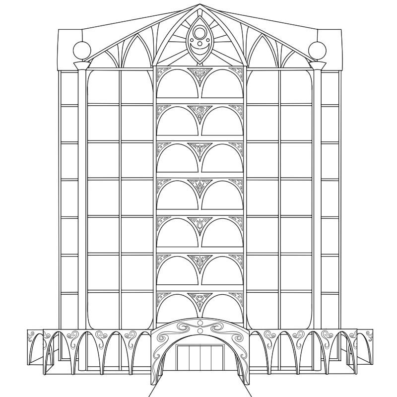
At this point, it was just tracing over my sketch and cleaning up any points that looked dumb. I also added some decoration to the walkway and balconies, in addition to changing the guild emblems on the arches. The primary guild emblem on the top floor was changed to something a little fancier.
Once that was out of the way, I went back to lining the angled view of the building. Wherever possible, I copy/pasted details from the front view to save time and my wrist, while working with the perspective guide to get everything else pointing right. And finally, I finished:

And then, of course, all of this effort was covered up in the actual page by that wall. Go figure.